Showing posts with label Connecting Essay. Show all posts

Tuesday, 5 May 2015

Connecting Essay Five


This animation by Reed + Radar  is of six model who have been placed in a line therefore it is easily to look at and doesn't get confusing at there are various shots of the same model which can seem busy to the audience. This animation is showing the same model is different outfit as well as allowing the audience to see a 360 degree shot of each outfit. All of the models outfits are black which contrasted against the white background and ensure that each outfit is the main focus of the animation. Lastly the fact that each outfit is shown one after the other, show that there is structure in the animation and it will be easier to look at for the audience. The movement of turning around is made in four 80 degree movements which keeps continuity within the animation. 


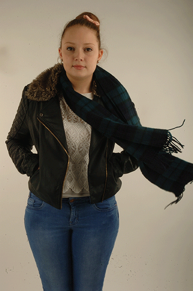
This is an example of one of my own animation which shows a 360 degree view of the model as she is turning around in the animation. The animation shows the whole of the models outfit and resembles something which you would see on a fashion website. Unlike the animation above, the movement of turning around is made of much smaller movements which makes the animation flow better rather than it jumping from one movement to another. The animation appears to stop slightly when the model is facing forward in order to make sure that the front of the outfit is the main focus. A black background has been used to create a contrast between the model and background and allows the model to stand out and be  the main focus.


Overall both of these animation connect as they both show a 360 degree view of the models outfit by her turning round. However the first photograph is showing one model in six different outfits where as my animation is just showing one outfit on the model.  

Connecting Essay Four


 This photograph  was created by David Hockney and it is a photo joiner piece of a  small town containing building, roads, cars and trees. This photo joiner has been created by by taking detailed close up of all the different element within this town. Then they have been placed back to together to create one photograph. The fact that the smaller images do not match up perfectly shows that this is a photo joiner as this something which is part of this technique. In the center of the image is the road which appear to become narrower, the further away that it becomes. This allows the audience to interpret where the may lead and whether that's where it ends. Lastly it is clear that neural colours have been used so that the images does not look too busy therefore effecting the overall photograph.

 This is an example of my work which is a animated photo joiner of the models eyes opening and closing. It is clear that it is a photo joiner due to each individual photograph not matching at the edge which is the main element of this technique. The animation changed from colour when her eyes are open to black and white when her eyes are close. The is representing what she see when her eyes are close without making the whole animation black as this what she will really see. By using the photo joiner technique, it means that the audience are able to see more detail of the model face than they would if it was just a normal portrait. 

Overall both of these photographs connect as they use the same technique which is a photo joiner, This is apparent due to the obvious features such as the edges not matching which is part of this technique. Also both photographs allow the audience to see the individual elements of the photograph in more detail than they would in a normal portrait or landscape. 

Connection Essay Three

This photograph created by David Hockney uses a multiple imagery grid to divide its contents into smaller section and a photo joiner technique in order to bring the photograph together to created a multiple imagery piece. The audience can see an old man sitting in a chair and because he is  alone and not really doing anything, this allows the audience to interpret the photograph as they look at it. The use of the tilling effect is a alternative editing technique to use to take a Multiple Imagery grid and make it look unique to other photographer work. The photo joiner techniques can also be seen in this photograph as each square does not match together perfectly. The colours within the image again, remain quite neutral and the image is intriguing due to the slight colour that has been added to the image in small sections which allows them to stand out slightly from the rest.


This is an example of my own work and i have created a multiple imagery grid in order to show the different rusted elements at North Weald Redoubt. Each individual square contains a close up which shows the small and intricate details of rusted cans, electric boxes and scrap metal. The way in which the grid is set out, it allows the audience to focus on one element at a time and therefore stops the photograph from looking too busy. The colour scheme contains mainly browns and reds which are the colours which you would associate with rusted objects, 


Overall both of these photographs connect as they both use a multiple imagery grid technique. This technique then allows the audience of both photographs to be able to look at each individual element of the photograph by looking at it a square at a time. This therefore stops the photograph from looking busy.

Connecting Essay Two


 This is an animation of a female model sitting on what looks like a vintage dressing table. This animation has very little movement which is the models hair and dress blowing in the wind and everything else is completely still. The movements are very soft and light which makes it look more realistic as if it is actually blowing in the wind. This animation has a very vintage feel which comes from the gold frame, the black and white picture and the candle holder which can be seen in the background. The colours are very neutral and not over power but this may be due to the creator of this animation wanting the movement of the models hair and dress to be the main focus opposed to the colours.


This is one of my animation which i made and it shows the model standing to the left of the composition whilst her scarf blows in the wind. The movement of the scarf fades in and out from one another to make the animation make look more realistic than it would if they where jumping from one shot to the next. Apart from the movement in the scarf, the majority of the rest of the model stays still which separates it from being a video. A white background has been used along with neutral colours. This allows the movement of the scarf to stand out and be the main focus of the animation.


Both of these animations connect as they only show very small movement of something blowing in the wind however everything else with the animation will be completely still. Also in both animation, neutral colours have been used in order to make sure that the small movements standout and that they are the main focus of each animation.

Connecting Essay One

This photograph is by Idris Khan and has used the technique of overlaying in order to create this photograph. It appears that this photograph is of a gas tower due to its obvious cylinder shape and the way that it is structured. The gas tower is in the center of the composition therefore it is the main focus of the photograph. However the fact that several photographs have been used, there is a slight distortion as to where each side of the gas tower is. When looking at the colour, it is clear that this photograph has been edited so that it is in black and white. However this has created different shades and tones of black, grey and white which i feel adds depth to the photograph and it also maybe representing the density of the gas inside the tower. The background is a bright white colour which contrasts against the different shades of black and grey in the gas tower. Overall i feel that this photograph has a ghostly and haunted feel due to the audience being able to see more than on of the gas towers and also that they are unable to distinguish what is actually in the foreground.
This is one of my photographs and it is of Big Ben.  This photograph has been created by overlaying various shots of Big Ben. It is in black and white which make the building look ghostly and haunted. This contrast against the fact this is well known tourist attraction and is not seen in this light at all. The Big Ben can be seen in the center of the composition and it easily recognisable due to its obvious features such as the clock and its tall, tower like shape. This therefore makes it the main focus of the photograph. When looking at the background, it is clear that it is of the sky however due to the fact that it has been editing into black and white, different tones can be seen which represent the clouds which are in the sky. Furthermore when looking at colour, it is clear that there are different tones and shaded of black and grey on the building which i feel adds depth the the building and shows that it is 3D.


Overall both of these above photographs connect due to them using the same technique of overlaying. Also they have both been edited to be in black and white which gives them a haunted and ghostly look but also allows you to see different tones and shades which confirm that the building are 3D rather than flat. Lastly they both use black and white to create a contrast between the main focus which is the buildings and the background which is the sky.